NOORA HEALTH
Project developed by Brand Union
Role: Design intern
Scope: Brand book, visual system, positioning
Year: 2016 (Summer)
Brand Union's 2016 summer internship project consisted in developing a brand strategy and a visual system for Noora Health.
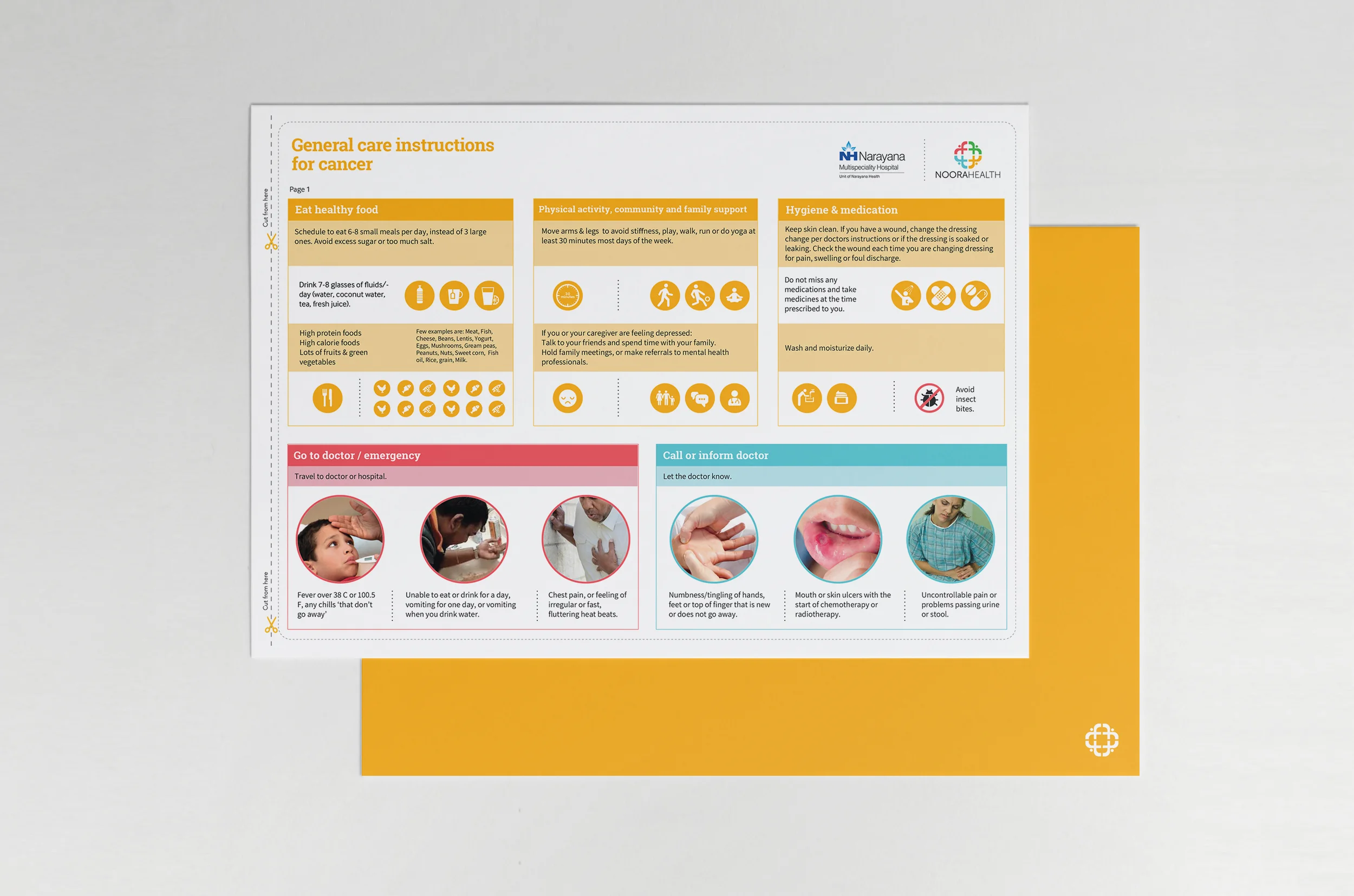
Noora Health is a Bangalore-based nonprofit with a hospital education platform that helps patients and home caretakers learn skills for recovering from a major medical event or managing chronic conditions. The Noora Health training program reduces hospital readmission rates by educating families to become active members of the recovery team.
Visual system:
Noora means ‘‘light’’ in Arabic, and Noora Health is the light that illuminates healthcare for poor and marginalized patients, families and communities. What is often seen as dark and frightening (being in a hospital) is transformed into a brightness and energy that says, ‘‘Don’t worry. You’ll be fine now.’’ To help reinforce this idea of light, the new visual system includes a series of complementary graphic elements that allude to illumination. The illumination device, Noora Health’s main visual element, mimics a spotlight by helping to highlight people and information. Gold, Noora Health’s primary color, embodies illumination and evokes the warmth and approachability that the brand represents. It is uplifting, and it helps express hope and optimism in all of the brand’s communications.
Tagline:
Turning families who can into families who care.