Persimmon
Client: Persimmon
Services: Branding and Packaging
Year: 2026
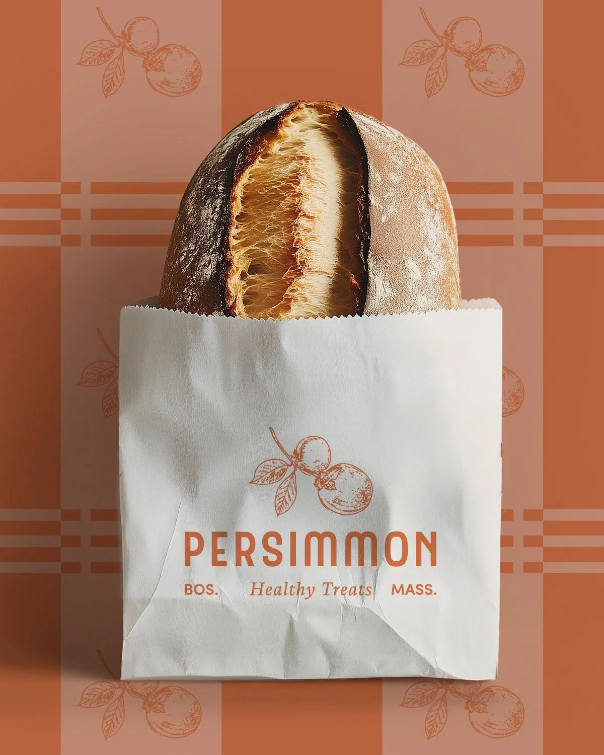
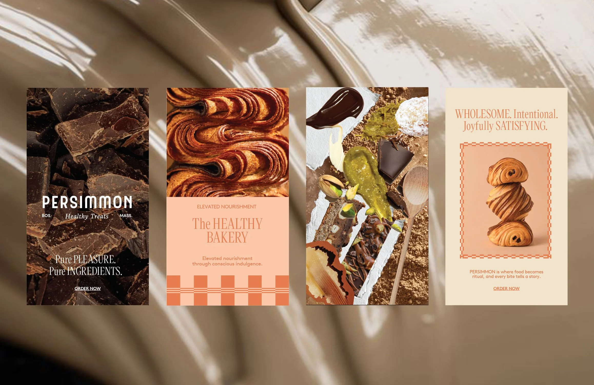
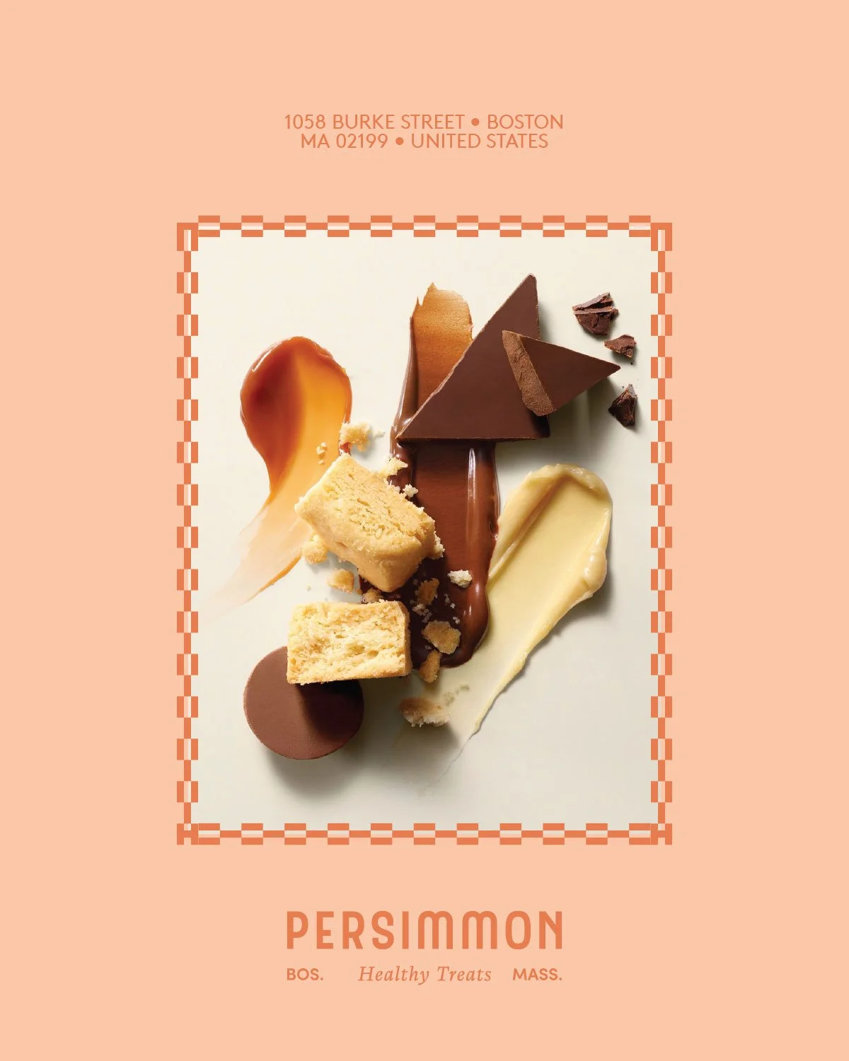
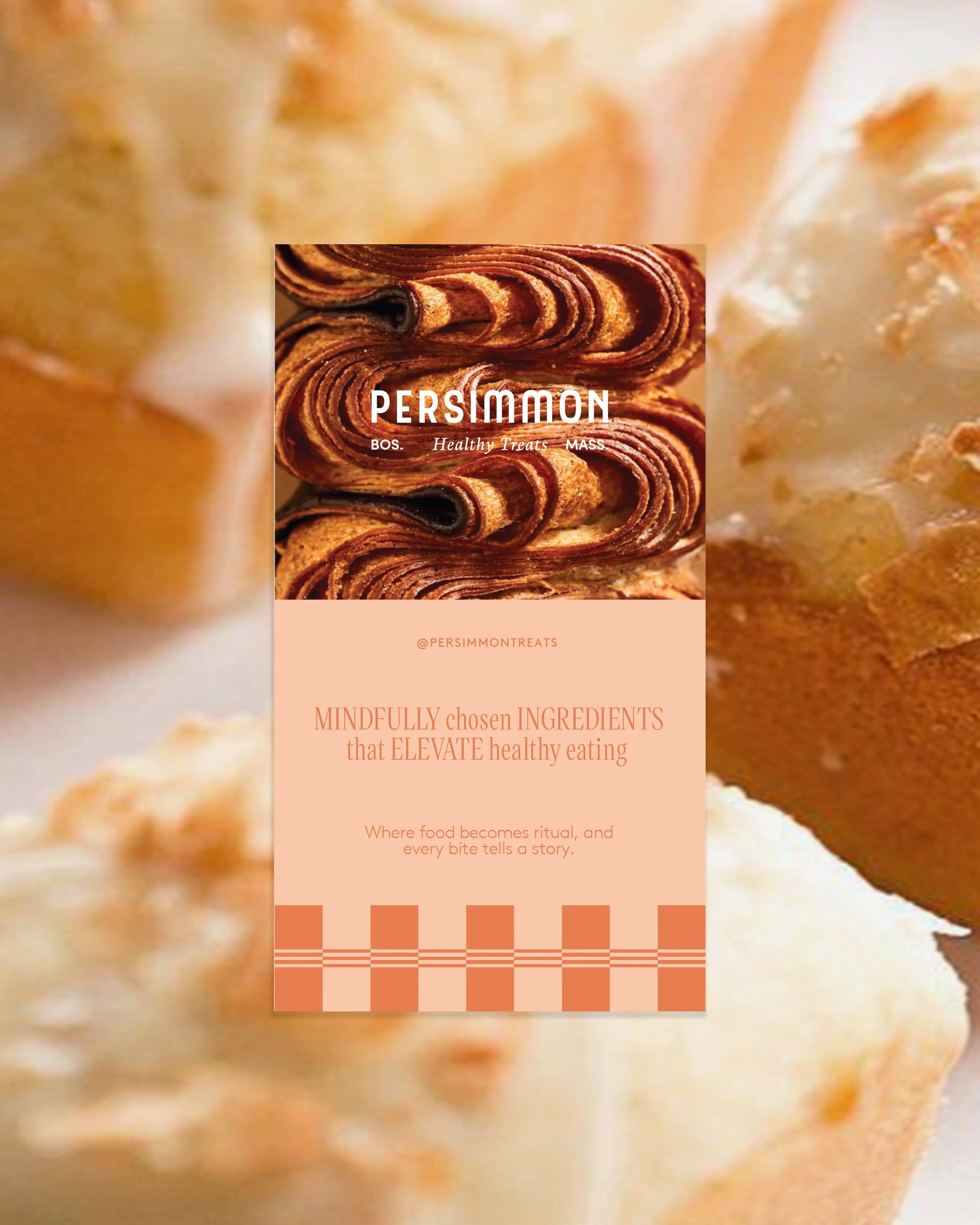
Persimmon emerges as a boutique sanctuary in Boston, where the precision of fine baking meets the soulful intention of modern wellness. Rooted in the philosophy of “elevated nourishment,” the brand redefines indulgence by eliminating ultra-processed ingredients in favor of mindfully selected, healing alternatives.
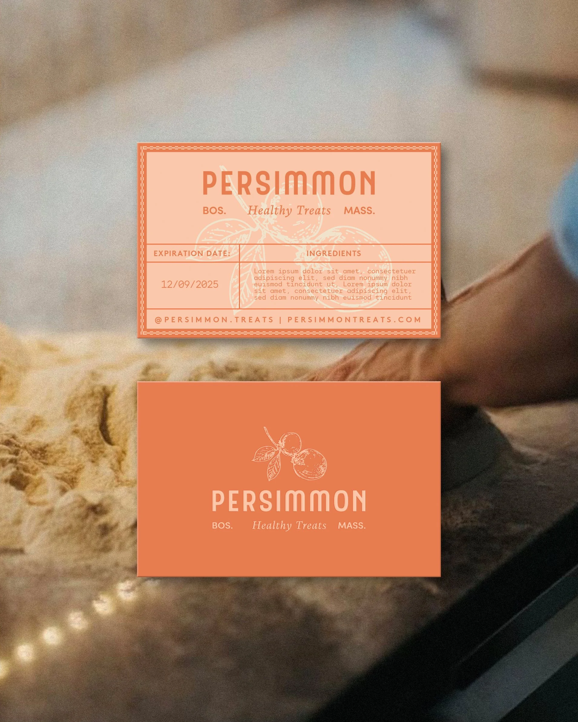
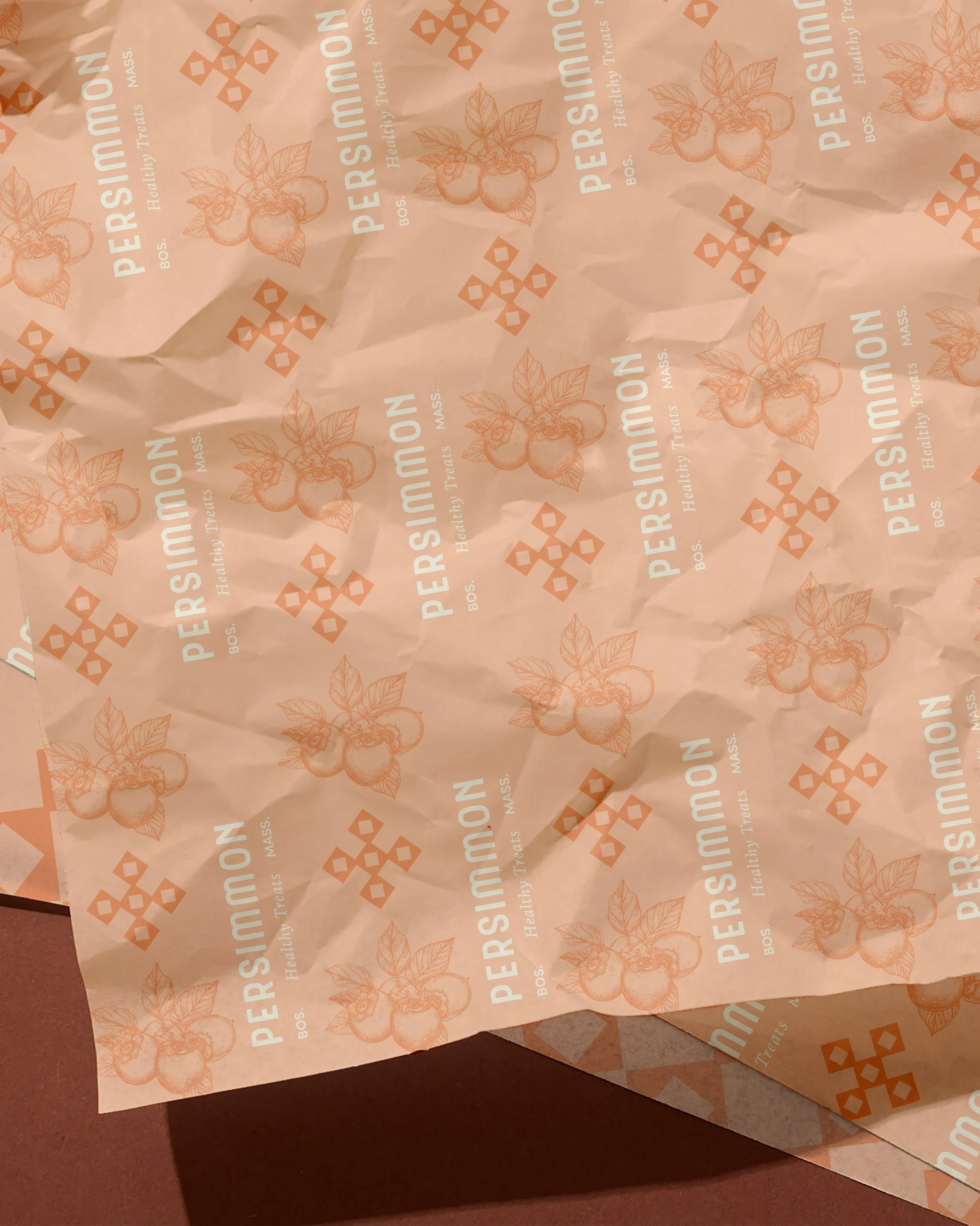
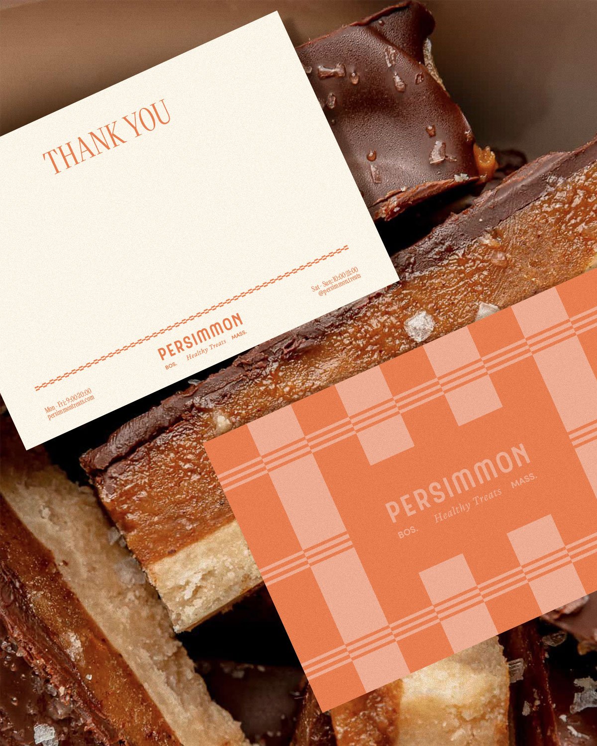
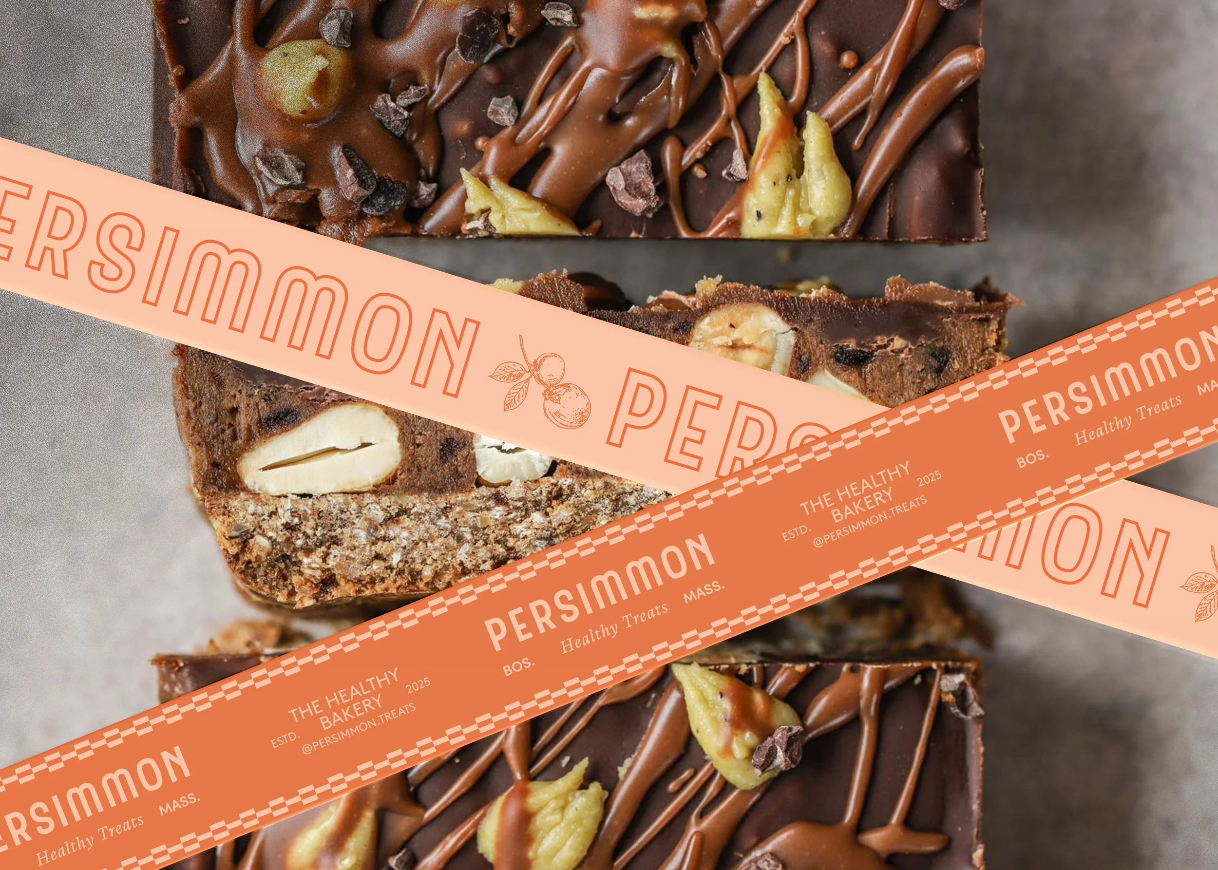
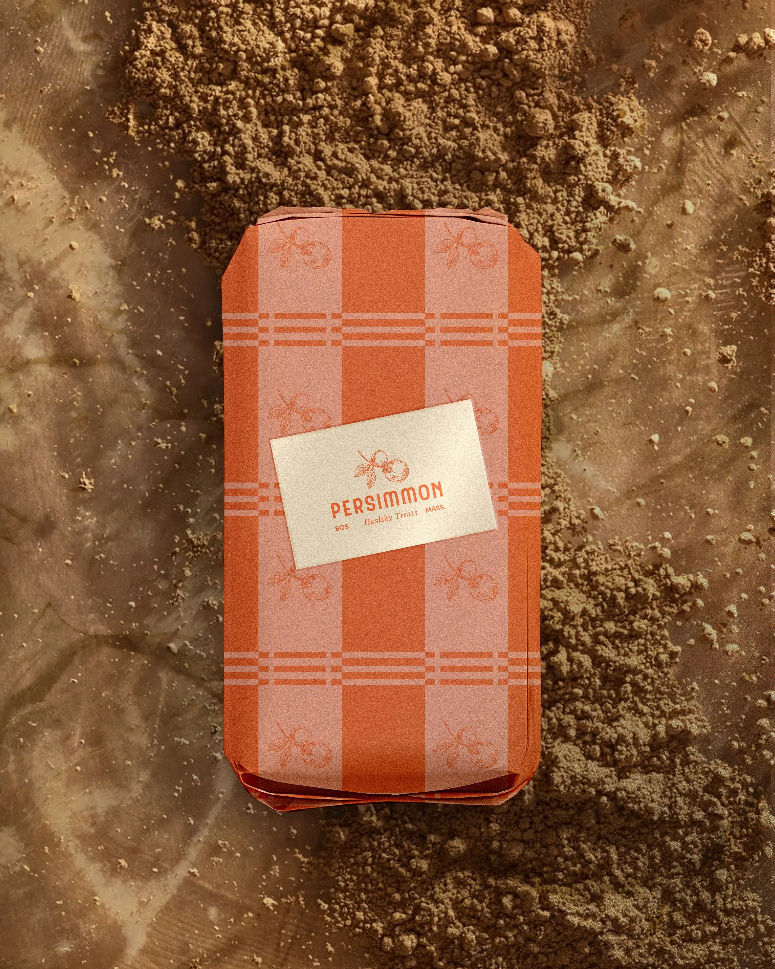
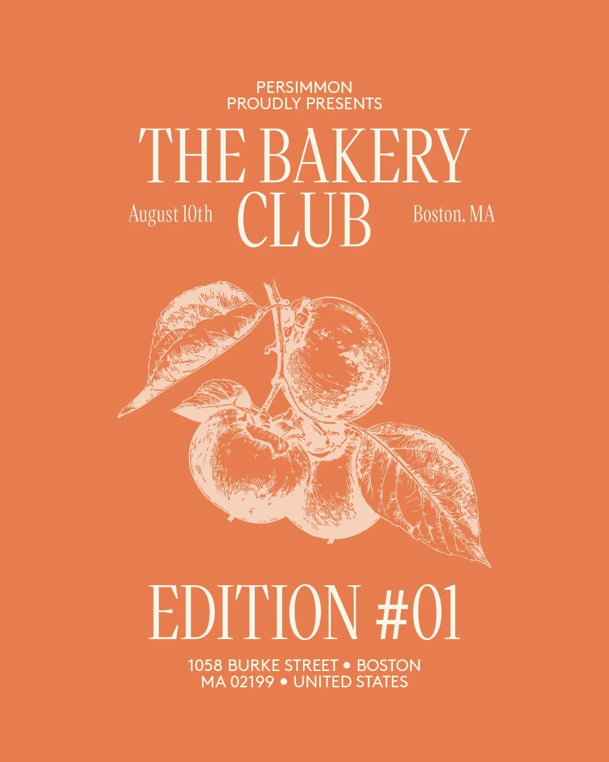
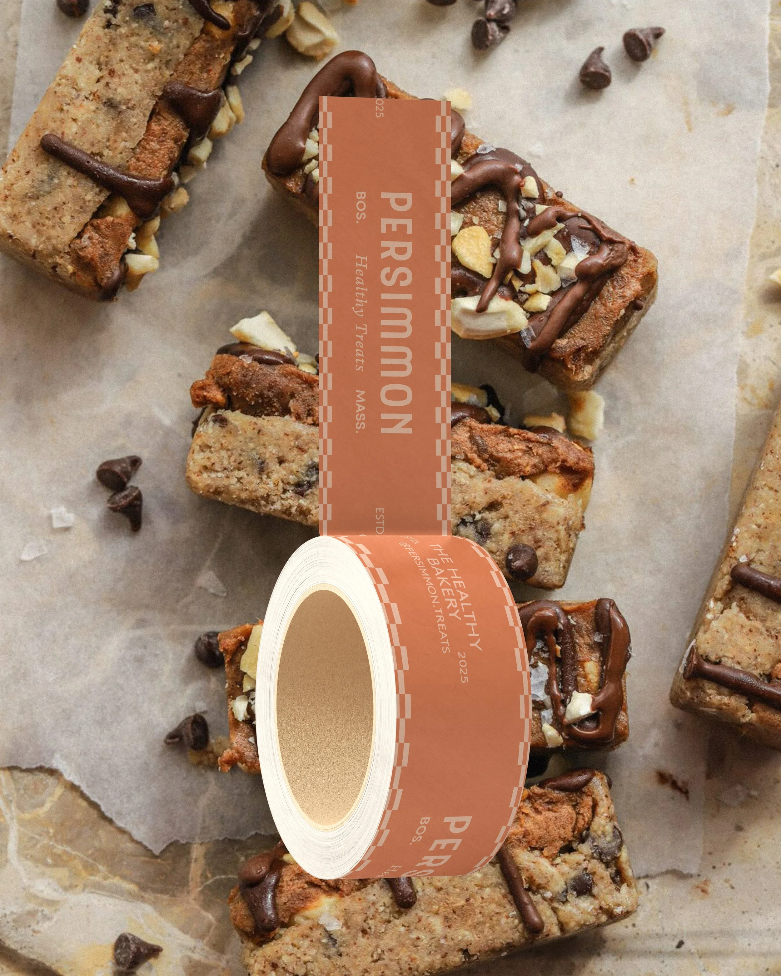
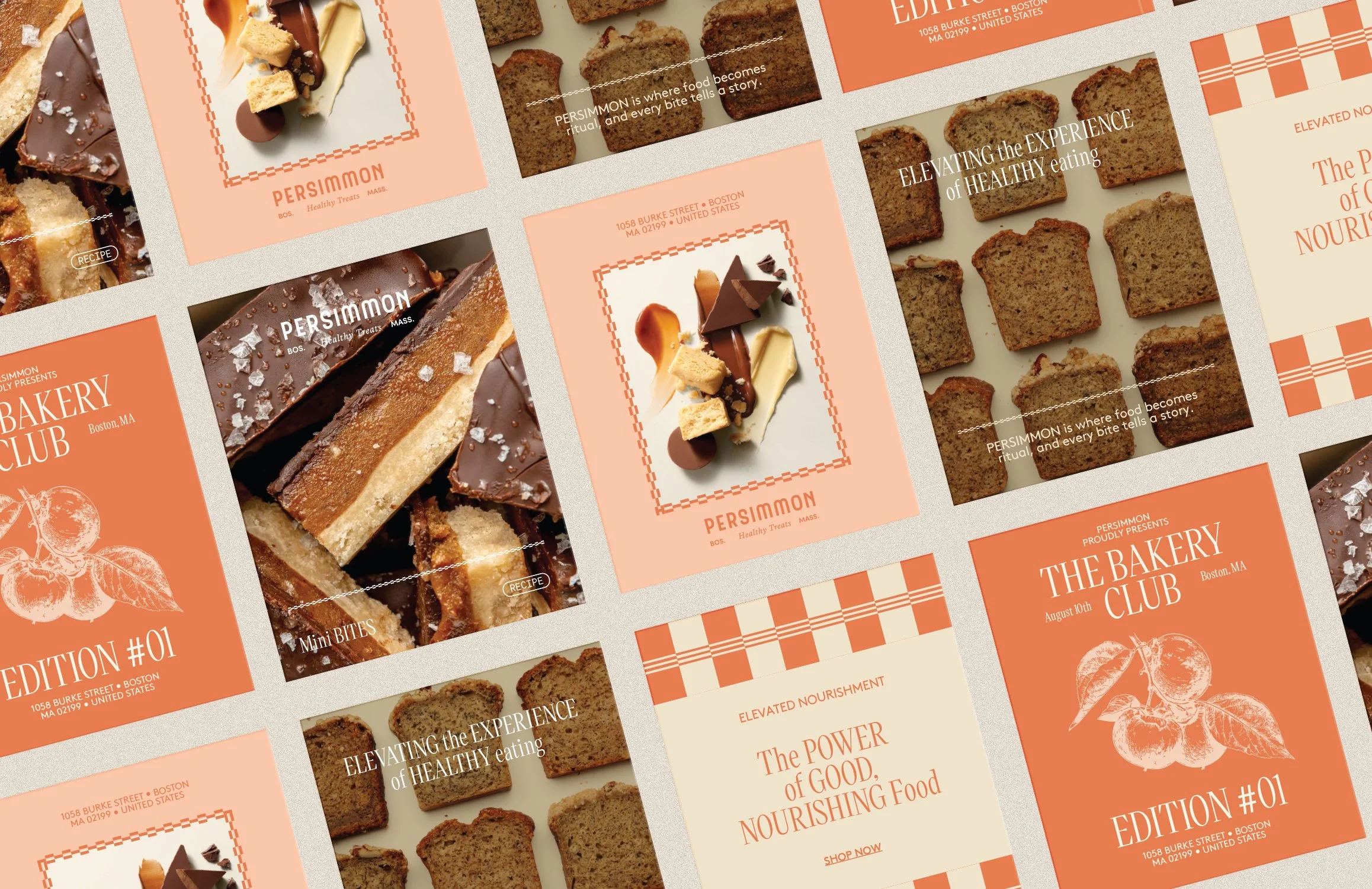
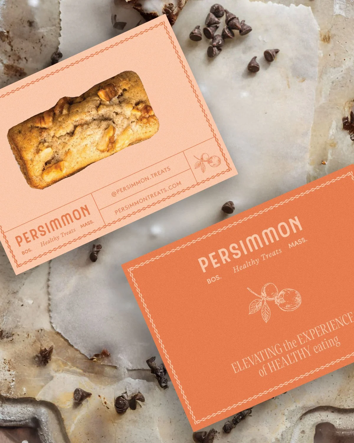
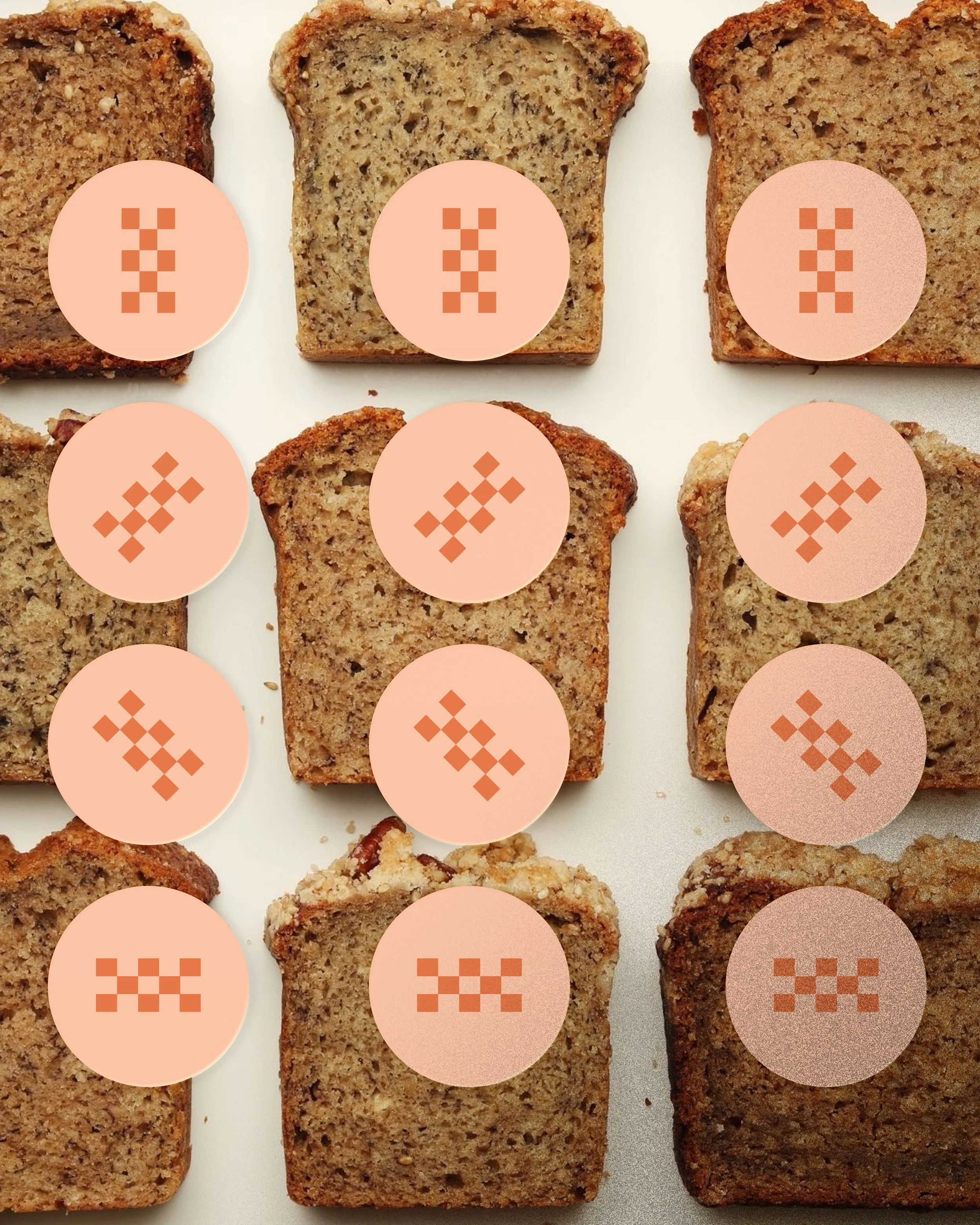
At ARCAL, we developed a series of distinctive patterns that echo both the artistry of fine baking and the layered richness of natural ingredients. The brand’s color palette and symbol draw direct inspiration from the persimmon fruit itself—its warm amber hues, organic geometry, and quiet vibrancy—translating the name into a refined and cohesive visual language.
The result is a harmonious balance between heritage and contemporary elegance, ensuring that every touchpoint tells a story of integrity, craftsmanship, and guilt-free delight.